Designing a Guided Quiz to Simplify Technical Eyewear Selection
Empowering Users with Education and Tailored Recommendations to Navigate Complex Lens Choices
End-to-End UX, UX Research, User Testing, UI Design, Prototyping


Overview
Client
REKS Optics — an outdoor performance sunglass brand emphasizing durability, shatter-resistant lenses, and functionality tailored for sports and active lifestyles.
Challenge
Improve the online shopping experience for sports enthusiasts by addressing common customer pain points:
Overwhelming number of lens options
Confusion between Trivex® and Polycarbonate benefits
Uncertainty about choosing the right style and performance fit
The team
A team of five UI/UX designers along with a design team lead had five weeks to develop a complete user flow, UI designs, a clickable prototype, and a client presentation.
My role
My contributions included:
User surveys & research
User flows
Low- & high-fidelity wireframes and prototypes for desktop
Conducting my own user testing
Project Brief
Design a way for potential customers to guide their purchasing decision when buying REKS sunglasses. Allow consumers to quickly understand sunglass options and which styles they would like to purchase. Reduce the number of clicks or back clicks so consumers can quickly learn and experiment with sunglass styles and options.
What’s a Guided Buying Experience? (G.B.E)
Guided buying is a persona-based user experience that makes it simpler for users to find what they’re looking for by providing assistance, advice, and direction.

Problem Statement
Problem Statement
As a sports enthusiast exploring REKS sunglasses, I'm enticed by their multiple offers but overwhelmed by the options. I seek durable, stylish, and protective sunglasses that provide excellent performance without breaking the bank. Need assistance in understanding the benefits of Trivex® vs. Polycarbonate lenses and identifying the best deals and suitable styles on their platform. Aim to nail the style and performance on the first purchase while ensuring value for money.
User-Centered Design Process
Our design process followed an agile methodology, structured into two sprints over five weeks.
Week 1 — Research & Analysis: We conducted user research to identify pain points and opportunities, laying the foundation to test our assumptions and design decisions.
Sprint 1 (Weeks 2–3): We developed low-fidelity prototypes, tested them with users, and gathered feedback.
Sprint 2 (Weeks 4–5): We refined our designs based on user insights, creating high-fidelity prototypes and a clickable prototype for our final client presentation.

Image Source: Justinmind.comResearch & Analysis
Understanding Our Users
During our first week, I explored the REKS website to empathize with users, delved into the project brief, and researched competitors to come together as a team and create a competitive analysis.
We conducted user surveys and journey mapped to gain deeper understanding.

Our team’s affinity mapping exercise during our competitive analyses.
Creating a Proto Persona

Mark
𐀪 42 ⟟ Denver, CO ⍋ Outdoor Adventure Guide
"I am an outdoor consumer and sports enthusiast who wants stylish sunglasses with performance and eye protection at an affordable price. I want multiple pairs to match my activities and outfits."
✔ Needs & Goals
Durable sunglasses for outdoor sports (hiking, cycling, fishing)
Strong UV protection & glare reduction
High-quality, affordable eyewear
✘ Pain Points
Too much jargon makes choosing lenses confusing
Hard to find durable sunglasses at a fair price
Lacks confidence in selecting the right pair
✦ Why REKS?
Shatter-resistant lenses built for an active lifestyle
Affordable pricing for multiple pairs
A simplified buying experience with clear guidance
Mapping the User Journey
Understanding Our Proto Persona’s Experience

Mark’s journey reveals a struggle in choosing the right frame shape and lens finish for his needs. A more tailored shopping experience with interactive guidance and clearer instructional content can simplify his decision-making and boost his confidence in order to make a purchase.


Evaluating the Competition
Forming Assumptions
To understand the market, we analyzed direct and indirect competitors’ guided buying quizzes. Our reactions helped us empathize with users and form key assumptions to later test in user surveys.
Key Takeaways
Simple & Concise Quizzes Felt Easiest
👏🏼 Knockaround & ROKA kept quizzes short (5 questions) with clear, everyday language.
😡 Eyebobs’ 7-question quiz felt like a waste of time.
Virtual Try-Ons Helped Visualize but Lacked Decision Support
Oakley, Ray-Ban, and Sunglass Hut recreated an in-store try-on experience with little to no additional guidance.
⁉️ Do users actually find them helpful? Is it enough to make a purchase?
Most Brands Lacked Product Education
Competitor sites often lacked clear explanations of lens options and benefits.
⁉️ Do users need more education to feel confident in their choice?
Discounts Encouraged Sign-Ups, but Forced Emails Felt Like a Trap
👏🏼 ROKA showed quiz results first, then offered a discount with an email sign-up — felt like a bonus!
😡 Blenders required an email in order to see quiz results — felt frustrating and forced.
Above are screenshots of competitors’ guided buying experiences.

My competitive analysis mapped brands’ guided buying quizzes based on level of customization (X-axis) and level of education provided (Y-axis). The bubble sizes indicate what is the closest competitor to REKS such as Ray-Ban and Oakley. REKS should aim to excel in both customization and education (top right corner).
🔗 Figma link: CK REKS - Case Study.
💡 Where REKS Can Stand Out:
Most brands lean towards either high customization or strong product education. REKS can lead in both by offering a personalized experience while educating users on why a product is right for them.
User Survey Insights
How Research Refined Our Strategy
To validate our assumptions, we conducted user surveys that revealed key pain points and opportunities. The insights led to essential refinements in the REKS Guided Buying Experience, improving personalization, product education, and user engagement.
1. Personalization Over Simplicity in Quizzes
Before
We assumed that a short and simple quiz would create the best user experience.
After
Users preferred personalized quizzes rather than short or generic ones. They wanted customized recommendations that felt unique to them.
🗣 "I’ve never felt like they’re actually personalizing something for me."
🗣 "The quizzes feel too generic and just suggest the same thing to everyone."
Solution
Keep the quiz concise but ensure genuine customization based on user input.
Use dynamic questioning to avoid generic recommendations.

🗣 "When it works it works, but it's annoying when you can tell it's just an upsell.”
🔗 Link to user survey results.
2. Virtual Try-Ons Didn’t Help with Fit or Comfort
Before
We believed virtual try-ons would help users visualize their choices and boost confidence in purchasing.
After
Users found them helpful for appearance only—but they didn’t provide enough guidance on fit or comfort.
🗣 "It helps with the look but not the feel."
🗣 "They didn’t look the same in real life as they did in the virtual try-on."
Solution
Supplement virtual try-ons with fit guidance (e.g., head width selection, frame recommendations).

Only 16% of surveyed users had heard of REKS.
3. A Knowledge Gap in Lens & Frame Education
Before
We assumed users already had enough knowledge to make confident lens and frame choices.
After
Most users lacked familiarity with key features, making education a crucial missing element.
78% of users had never heard of REKS' Color Boosting® lenses.
Solution
Integrate educational content into the quiz to explain lens technologies and benefits.
Use visual comparisons and interactive elements to help users understand features without overwhelming them.
REKS Opportunity
The GBE should position REKS as a high-quality, affordable brand by educating users on unique lens and frame technologies.

Screenshots of a virtual try-on experience from one of REKS’ competitors.
4. Email Collection: Encourage, Don’t Force
Before
We assumed that forcing email collection before showing quiz results might increase conversions.
After
Users were reluctant to share emails upfront — but email still played a critical role in driving sales.
Website analytics show email is a primary traffic driver for sales.
Solution
Show quiz results first, then encourage email signup with an added incentive.
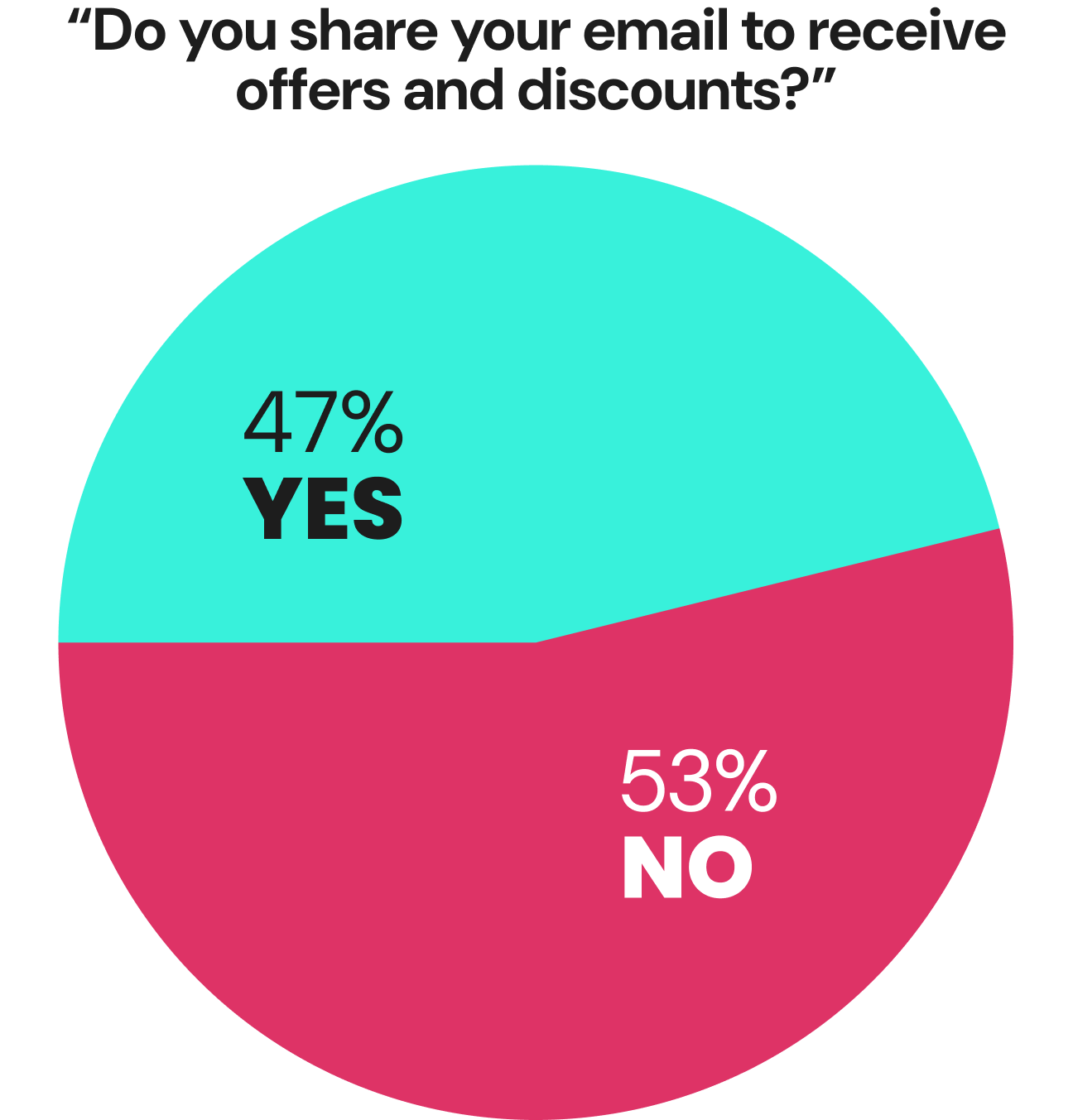
53% of users won’t provide an email just for a discount.
Ideation & Design Phase
User Flow Insights
Building on our research and analysis, I mapped out user flows to anticipate decision points, pain points, and opportunities for a frictionless path from product discovery to purchase. The goal was to balance performance and style considerations while reinforcing REKS' brand value.

A decision tree flow ensured users saw only relevant questions based on their priorities—performance, style, or both—creating a streamlined experience. Early iterations also revealed ski goggles needed a separate flow since they required no customization.


Even from a high-level view of two iterations of my user flows, the decrease in quiz length is clear by the final user flow — an example of Miller’s Law of UX.
Optimizing the User Flow with Miller’s Law
To streamline the Guided Buying Experience, I applied Miller’s Law, which suggests that people can hold only 7±2 items in their working memory. By chunking related lens and frame technology questions, we reduced cognitive load, making the quiz faster and easier to complete while maintaining clarity.
Refining the Flow for Simplicity & Personalization
Before: Each lens technology—polycarbonate, mirrored, & prescription—was presented as a separate question, lengthening the quiz and increasing user fatigue.
After: We streamlined decision-making by chunking lens-related questions into a single selection step—except for Trivex®, a key differentiator for REKS, which remained a standalone question to highlight its unique benefits. This streamlined the experience while reinforcing REKS' brand story.

I referred to Miller’s Law to streamline the quiz and lower cognitive load. The law states the average person can only keep 7±2 items in their working memory at a time.

I incorporated the idea of chunking to my user flow, which is a psychology concept closely related to Miller’s Law where pieces of an info set are broken down and then grouped together in a meaningful whole.
Key User Flow Takeaways
Sports-Specific Journeys
Ski goggles required a dedicated path for better segmentation and a tailored user experience.
Tailored Customer Paths
Performance users focused on usage and technology.
Style & Performance users explored fit and frame preferences, while still being introduced to REKS' Trivex® and other lens technologies.
Streamlined with Miller’s Law
Chunking lens-related questions reduced cognitive load, speeding up decision-making while shortening the quiz for a smoother experience. Trivex® remained a standalone question to highlight its unique benefits.
Balanced Efficiency & Personalization
Fewer clicks, clearer recommendations, and a frictionless experience for all user types.
Journey Mapping Insights
Crafting a Frustration-Free Path to Purchase
To evaluate the impact of our Guided Buying Experience (GBE), we updated the journey map for our proto-persona, Mark.
Pain Points Before the GBE
Lens Selection Confusion
Unclear differences between lens options for Mark’s outdoor activity led to hesitation.
Lack of Product Confidence
Uncertainty about fit and lens technology increased the likelihood of site abandonment.
Decision Fatigue
Too many frames and lens options without clear guidance made the process overwhelming.
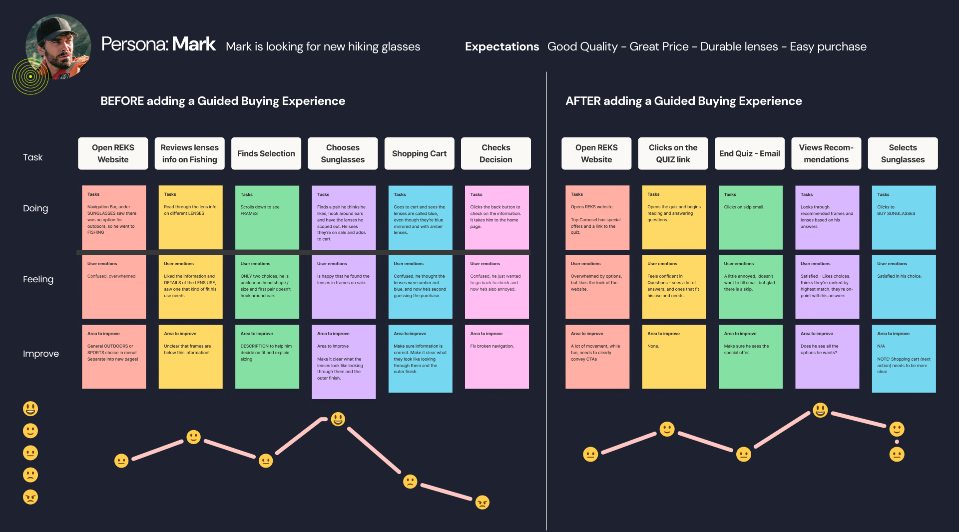
The user journey before a guided buying experience.
The user journey after a guided buying experience.
Improvements With the GBE
Simplified Lens Selection
Clear, structured questions made it easier for Mark to compare and choose the right lens for general outdoor activity.
Personalized Recommendations
A tailored quiz path based on Mark’s needs improved confidence in his purchase.
Reduced Friction
Streamlining questions and providing relevant education helped guide Mark to a confident decision faster.
Iterating Low-Fidelity Wireframes for a Testable Prototype
To refine the Guided Buying Experience (GBE), I rapidly iterated on low-fidelity wireframes while conducting early user testing to validate core interactions.
This fast-moving process ensured that usability issues were identified and improved early, allowing for informed design decisions before moving into high-fidelity designs and prototyping for the final client walk-through

Key Areas of Iteration
Clear Entry Points from the Homepage
Ensured seamless access via hero banners and navigation links, aligning with Jakob’s Law—users expect websites to function like others they’ve used. This also follows usability heuristics like Visibility of System Status, helping users immediately understand where to begin, and Recognition Over Recall, allowing for intuitive navigation without relying on memory.
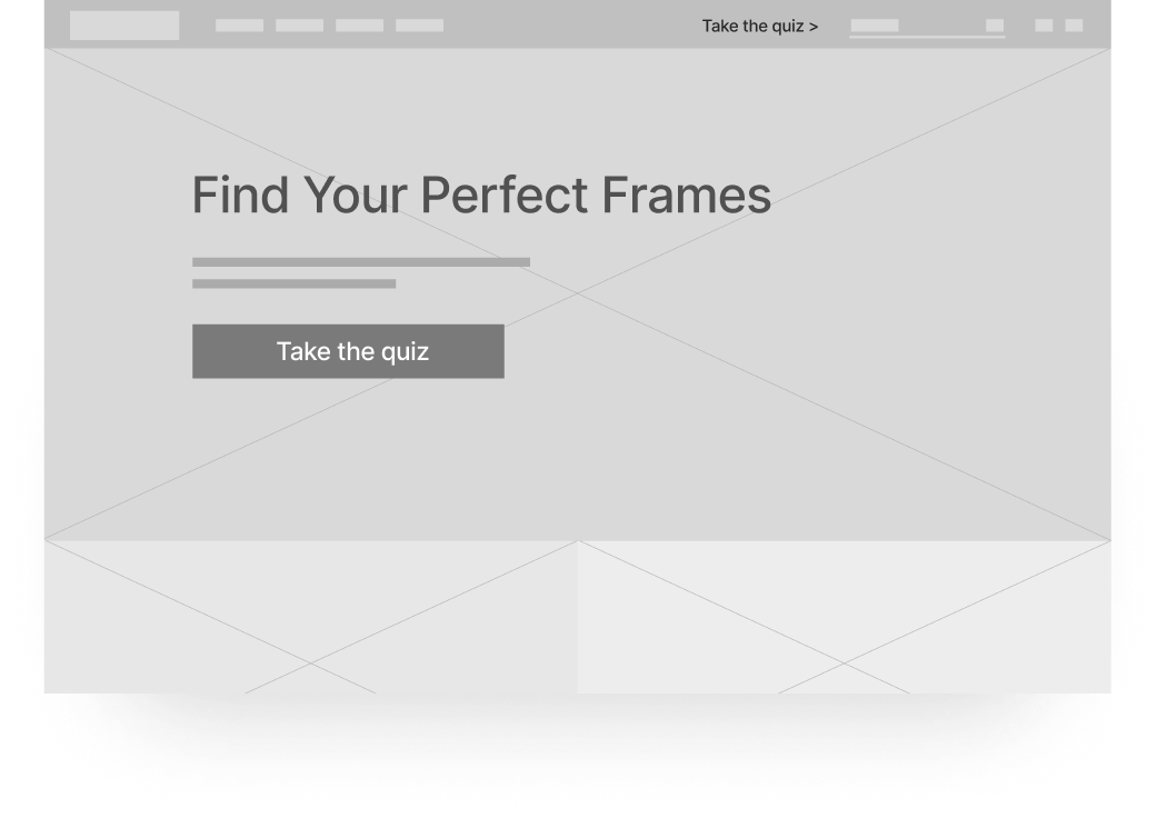
Homepage sketch to access the GBE.

Style & Fit Questions
Iterated multiple times to align with REKS’ brand, refining the face shape question to be both clear and relevant without feeling off-brand.
Low-fidelity wireframes iterations for the face-shape question. Ultimately the last wireframe screen felt the most aligned with the REKS brand and was ready for user testing.
Interactive Information Overlays
To prevent cognitive overload, I implemented tooltips for Trivex®, polarized, and polycarbonate lenses, allowing users to access technical details only when needed.
This approach follows NNG’s principle of Progressive Disclosure, ensuring users aren’t overwhelmed with information upfront but can engage deeper at their own pace.

Low-fidelity wireframes showcasing Trivex® and lens technology questions, incorporating educational tooltips for on-demand informational overlays.

Refining the Guided Buying Experience Through User Testing & Iterative Design
I created a clickable prototype from the low-fidelity wireframes to test key interactions. Users were asked to imagine they were shopping for sunglasses for outdoor activities and to navigate the Guided Buying Quiz to find the best lenses for their needs.

User Testing Insights & Adjustments
1. Improving Lens Education Without Disrupting Flow
Issues
Lens Technology Confusion: User clicked to read the additional modal explanations, but still struggled to grasp its benefits.
User answered “yes” and “unsure” even after reading more information about Trivex® and polycarbonate.
Terminology Issues: Technical terms used to describe lens technology were not appropriate for general audiences.
User stated he wasn’t familiar with the word, “oleophobic.”
Confusing Imagery: Failed to clearly convey how different lens colors and technologies impact vision.
Solutions
Replaced text-heavy modals with concise, scannable info, icons, and imagery according to the Aesthetic and Minimalist Design heuristic. Avoids the “wall of text” issue discussed in Laws of UX.
Replaced technical jargon with everyday language for a general audience with heuristic #2 by Matching Between System and the Real World.
Improved side-by-side comparisons for clearer lens differentiation to eliminate ambiguity.
Before
✘ Confusing visuals that didn’t provide clarity

🔍 User selected “yes” and “unsure” even after reading more information about Trivex® and polycarbonate.

After
✔️ Clear side-by-side visuals to convey the effects of polarized lenses.

Before
✘ Text-heavy page with technical terms such as “oleophobic” resulting in cognitive fatigue.

After
✔️ Chunking of scannable text with groupings of iconography, and everyday language for a general audience.
Heuristic #2 Match Between System and the Real World and #8 Aesthetic and Minimalist Design.

2. Streamlining Lens Technology Questions
Issues
Fragmented Selection Process: Separate questions for Trivex®, polarized, and other lens options (polycarbonate, mirrored, prescription, transition) disrupted quiz flow.
Missed Brand Differentiation: Trivex®, a key REKS feature, wasn’t emphasized effectively.
Solutions
Emphasized REKS' Core Differentiator: Highlighted Trivex® lenses as a standalone feature to reinforce their unmatched durability, clarity, and lightweight advantage—key to REKS' brand identity.
Consolidated Lens Choices: Combined polarized, polycarbonate, mirrored, prescription, and transition lenses into one step for easier selection—leveraging Miller’s Law in which chunking simplifies decision-making.
Reinforced Brand Positioning: Renamed polarized lenses as "Unbreakable Polarized Lenses" to highlight REKS' core durability promise and align with REKS’ key selling point.
Before
✘ Too many separate lens feature questions: Trivex®, polarized, polycarbonate, mirrored, prescription, transition, diluting focus on REKS’ key differentiator: Trivex® .

After
✔️ Trivex® highlighted in its own question while all other lens features were consolidated, reinforcing REKS’ brand identity.

3. Refining Face Shape, Fit & Style Selection
Issues
Face Shape Confusion: User found face shape terminology (e.g., triangular, square, oblong) confusing and struggled with self-assessment.
User stated that he “didn’t know” his face shape and appeared doubtful of his face-shape selection.
Brand Misalignment: The question felt more fashion-driven than performance-focused, misaligning with REKS' core audience.
Solutions
Refocused on Style Preference: Introduced an additional question about the frame-shape rather than face-shape, shifting the focus from subjective self-evaluation to user preference.
Aligned with Real-World Understanding: Applied NNG’s Match Between System & Real World heuristic by replacing abstract face shape categories (triangular, heart-shaped) with head width ones—offering a measurable and objective fit assessment.
Before
✘ Confusing and abstract face shape terms misaligned with REKS' performance focus.

After
✔️ Introduced a preference-based frame shape question (rather than face shape) for clarity and personalization in the high-fidelity designs.

✔️ Used measurable head width categories rather than abstract face shapes for easier self-assessment in the high-fidelity designs.
Heuristic #2 Match Between System and the Real World.

4. Clarifying Use Case Selection
Before
✘ Ambiguity led to uncertainty in selection process, increasing decision time and cognitive load according to Hick’s Law.
✘ User hesitated when selecting "Sun Blocking / Medical", unsure whether it referred to general UV protection or prescription needs.

After
✔️ Applied Miller's Law to reduce cognitive load by categorizing information into two distinct choices: (1) Sun Blocking and (2) Prescription/Medical for clearer decision-making.

5. Email Sign-up Resistance
Issues
Low Sign-up Rate: User skipped the email entry field, even when incentivized with a 10% discount.
High Drop-Off Risk: Forcing sign-up before showing quiz results created unnecessary friction.
Solutions
Reciprocity Principle to Build Trust First: Made email entry optional, delivering quiz results first to encourage voluntary sign-up.
Encouraged Voluntary Sign-up: Let users see value first, increasing willingness to share their email.


High-fidelity design of the email-collection screen displaying the Reciprocity Principle where users have the ability to skip email-collection to see their results.
6. Driving Results Page Engagement
Issues
Limited Frame Variety: Users valued interactive lens previews but wanted more frame style options.
Wireframe Confusion: Placeholder content and non-functional buttons made prototypes confusing for user to navigate.
Solutions
Expanded Frame Recommendations: Future designs prioritized showcasing more frame styles on the results page.
Enhanced Prototype Clarity: Aligned with Jakob’s Law to ensure interactive elements behaved as expected, reducing user confusion.
Progressive Disclosure to see more results: Usability heuristic keeps the interface simple by showing most relevant results first to reduce cognitive load. User can choose to reveal more content as needed.

Placeholder content and non-functional elements in the low-fidelity prototype caused confusion for the user.
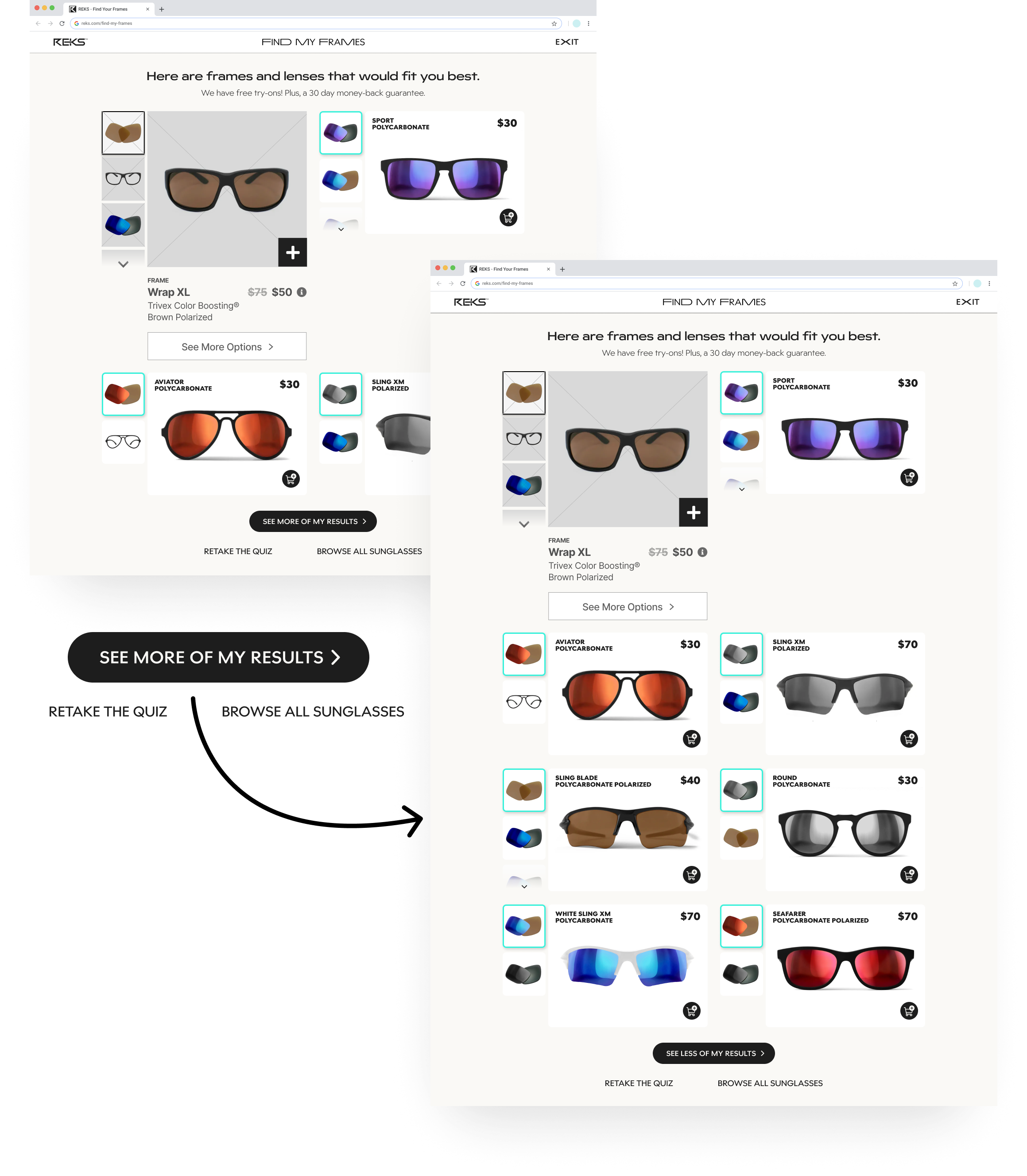
High-fidelity designs give the user power to see more frame styles, retake the quiz, or browse all sunglasses.

Mobile Responsiveness
Given our project’s 5-week scope, full responsive designs weren’t feasible for each team member. Instead:
Each team member focused on either desktop or mobile to maximize efficiency.
Mobile designs demonstrated the adaptability of the guided buying experience.
A teammate’s mobile prototype further explored responsive solutions.
What We Learned
Strengthened REKS’ Brand Differentiation
Focused on high-quality, affordable, stylish, and unbreakable sunglasses, ensuring clear messaging around durability and performance.
Empowered Confident Purchasing Decisions
Simplified lens and frame selection to help sports enthusiasts make more informed purchasing decisions.
Designed for Usability & Scalability
Delivered four high-fidelity prototypes (two desktop, two mobile), setting a foundation for a responsive experience in future iterations.
Lowered Barriers to Entry
Used clear, everyday language to make the shopping experience more accessible for a broader audience.
Recognized the Value of Iteration
Future improvements will be driven by user feedback, analytics, and market trends, ensuring REKS stays aligned with evolving consumer needs.
